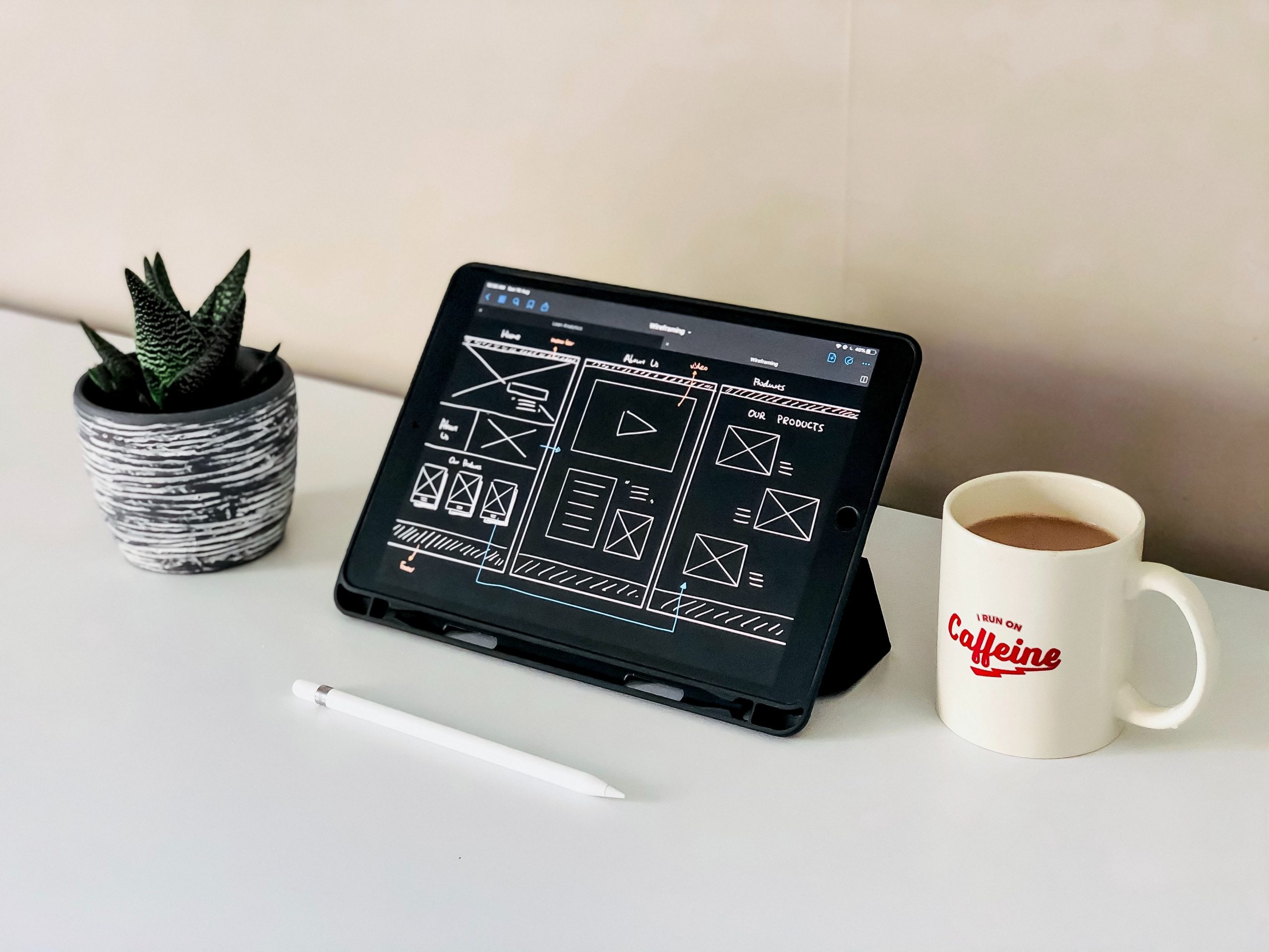
Many facets go into creating a great website design. While having a pleasing look or aesthetic is important, great design creates friendly functionality. This high level of design guides your users through your website to exactly where they need to be to convert. Here we will go over 10 do’s and don’ts for creating an exceptional business website.

Who are your customers? Take a look at your current customer base and discover their demographics. This is important to know so that you can design with them in mind. Try creating a customer avatar. What does your average customer/user look like? How old are they? Are they mostly male or female? How much money do they make? What do they enjoy doing and purchasing? All of this information can be used in the design. For example, if your user base is mostly older, you might increase your font size.
Have you ever been to a restaurant with a giant menu and found yourself getting frustrated because you can’t choose what you want to eat? Website navigation is similar. If a user gets too confused and doesn’t know what to select, odds are they will give up and try another website. Keep your main navigation as simple as possible.
A CTA or call to action lets your user or positional customer know where to go next. Using a CTA in key areas of your website prompts the people visiting it to take an action. Some examples of calls to action are “Buy Now”, “Learn More”, “Sign-Up”, “Subscribe”, “Try for Free”, and “Get Started”.
Web-safe fonts are fonts that can adapt to any browser or operating system. Using web-safe fonts ensure that regardless of what type of device or browser they are using, your website will look the same and your content will render. If you use obscure fonts some people may not be able to see it on their device. Here are some web safe fonts to consider.
White space in design is simply the empty areas between content, photos, and other graphic design elements. Proper use of white space allows the user's eyes to go where you need them to go. Too much design or copy can confuse your user and deter them from staying on your website.
Color is a powerful tool in website design if used properly. There is a psychology to color, and it needs to be used correctly. For example, use color on your buttons and to point out key content. Avoid using too many colors because it will only confuse your user and not get them to click and/or convert.
People are visual beings. Beautiful photography and video can make or break your website, especially if you are selling a product. If you don’t have the means to shoot your products or services, consider hiring a professional to help.
Google and other search engines look for certain things on your website to tell them what your website is about and who to show it to. Be sure to add keywords for your industry in your copy. Think about how one would search for a company like yours and include content that uses those words. On the backend on your website be sure to add H1’s, metadata, and alt tags to photos. If you are not sure how to do this effectively, reach out to a website design company and they can help.
Creating new content consistently does two great things – improves your SEO and keeps your userbase engaged. Google loves when they see new content on your website. Try blogging once a week about your company. Be sure to share those blogs on your social platforms to keep your customers aware of news and new products. The key to content writing is keeping it consistent. If you do not have the time to keep up with a schedule, many skilled copywriters can help.
Creating and maintaining a website is a big undertaking. If you are not familiar with designing and developing, it best to hire a professional. These people are experts in their fields and can develop your website faster and more efficiently. Doing it yourself if you are not experienced can cost you more time and money. Save yourself the headache and leave it to the professionals.
